Open links in new windows

Financial Services Enterprise Rewards Feature


Enterprise Rewards are the various incentives for opening a new account for potential customers. For example, open a savings account and deposit $10K by March 1st and receive a $150 cash back bonus. Customers often call with questions about the incentive – when will I receive my cash back bonus?, how much more do I need to deposit?, your site says I do not qualify for a cash back bonus: why? – and the call center agents needed a feature to easily determine these answers.

The initial design provided this information, however formative usability testing revealed that a significant portion of users had various difficulties quickly finding the correct answers. 
 
Enterprise Rewards early design
 
This prompted several design iterations eventually resulting in a design that users found much easier to understand and could quickly determine the answers to customer questions. This was accomplished by visual rearrangement of fields, extensive rewording, improved grouping, and improvements to the labeling and clarity of the infographic that answers the top 6 commonly asked questions.

Enterprise Rewards final design

Financial Services Call Center Application Redesign


Atlas is the internal name for the Discover Financial Services call center software that agents use to handle customer inquiries and requests. It is a modern UI wrapper around several disparate systems, including two mainframe core banking systems that is significantly easier to use and provides a unified UX. In addition to the call center agents, the system is also used extensively by back-office banking operations as many of their tasks are far easier to accomplish in Atlas than with the underlying systems.


Version 1 of Atlas envisioned a dual screen application, with the left monitor displaying the Know Me screen and the right showing the Help Me screen.

Know Me screen (current)

Help Me screen (current)


The design intent was to enable the call center agents to understand and know their customer from a profile and product mix standpoint. The agent could then move to the Help Me screen to perform the necessary actions to resolve the customer call. Unfortunately in practice the system was rarely used in this manner. Agents tend to immediately jump to problem solving mode and almost exclusively use the Help Me screen and functions. Additionally, many of the operations in the system are highly modal, there are many pop-up windows and dialogs, access to customer actions and account actions are disjoint, and there is much information that is initially hidden behind many menu choices.

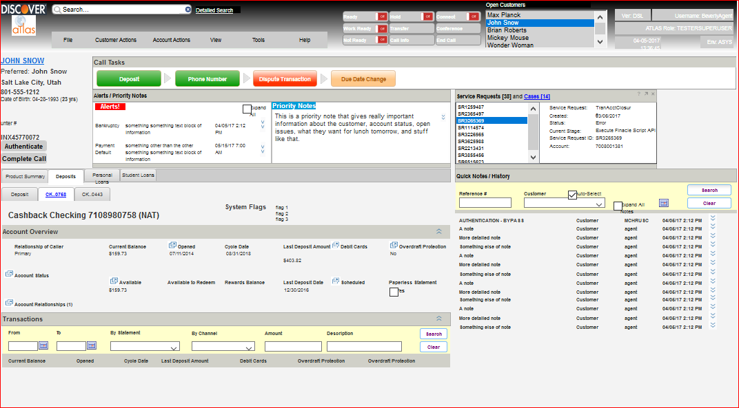
Thus there is goal to redesign Atlas to improve usability and usage. In addition, DFS is moving to a new technology stack – HTML/CSS/JavaScript will replace the current Java application - in order to leverage modern UI and database techniques. I was tasked with developing an initial version of the potential new design. This is reflected in the Atlas 2.0 Main screen below (note: downscaling the browser image resulted in incorrect placement of some checkboxes in the image file).
Key design objectives and improvements:

  • Single monitor application
  • Display a greater amount of relevant information at the start of the call once the customer has passed the security questions
  • Enable multiple customers to be open simultaneously
  • Integrate the soft-phone control panel that is currently a separate application
  • Improve the visual flow through the screen
  • Implement a call task workflow indicator/control via machine listening and AI pattern matching


EHR Template Library

The ADP Advancedmd EHR (electronic health records) application relies on structured templates to record patient data. These can be simple or extremely complex, the latter requiring significant effort to create. Product Management desired a way for end users to select pre-built templates based on medical specialty from a library. Future functionality would include a community aspect where doctors could upload templates they created for others to use. The following screen designs were the initial UX deliverables. The developers actually began their coding from digitized whiteboard sketches that were produced during a co-design session with product management and lead developers.

Template library administrative screen 


Gallery view (non-administrative)


Template upload dialog


Version 1.0 as shipped (some elements and features deferred to later versions)

Usability Studies

Some examples of reporting the results of various usability studies.

1. iPad patient kiosk application. A loaned iPad enables patients to fill out and sign forms that are typically paper based. Primarily a formative study, several quantitative metrics were collected and analyzed. This is a medium level of formal reporting.

Patient Kiosk internal study

2. Powerpoint presentation of the patient kiosk study results to the development team and upper management.

Kiosk Results Presentation

3. Attaining certification for Meaningful Use Phase 2 required a demonstration of a user centered design process. The US governing body decided to use formal, summative (quantitative) usability studies as this demonstration, requiring studies of 7 electronic health record functions that can impact  patient safety, reported in NIST common industry format. This is the final report for electronic prescribing.

Electronic Prescribing Formal Report

Medical Provider Dashboard

The US government has provided stimulus funds to encourage medical providers to adopt the use of electronic health records software, calling the program Meaningful Use. There are several stages and numerous criteria and measures that providers must achieve in order to receive funds. Tracking where they are in the various measures has been a source of user complaints as it required running a report for each measure; there was no simple, quick way to see their status at a glance. A measures dashboard was designed to achieve this goal.


Telemedicine design

In a remote telemedicine application, two main screens would be necessary - one for the patient and the other for the medical provider. These were the initial wireframes at the outset of the project.


Data Center Visualization

Various mock-ups of the components of a data center visualization application:


Device manager screen


Detailed rack view


Selected rack information pop-up


Plan view with a selected rack


Plan view with capacities

Interactions Article

This is the article on common usability myths that ran in Interactions Magazine:
Whiteboard Article PDF